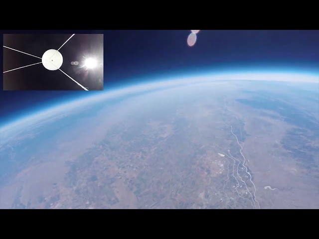
Many years ago I flew a high altitude balloon with a few friends. I built a custom controller for it.
I’ve recently been wanting to fly another, and I got into a discussion about a friend’s recent flight where the cameras failed. My cameras failed too, and I wanted to see what I could see in our logged data regarding temperatures.
I tried using Swift Charts for this, thinking this would be a neat way to experiment with that, but was dismayed to discover it doesn’t support multiple Y axes (with different scales). Having used Chart.js before for this, I thought perhaps I could integrate it into this blog post.
I succeeded, but the data is rough. It needs filtering and decimation, as there are far too many data points to display reasonably on this page. And what’s up with the altitude data being pinned at 12,069.6? That’s 39,598.4252 ft, doesn’t seem like the silly cutoff (I’m pretty sure my GPS was not constrained).
Anyway, it’s late. I’m going to publish this, and maybe come back to it again in the future.
(If you widen the browser window and reload, it’ll redraw the graph bigger.)

